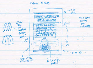
 Having settled on an idea that I thought could work, I put together a sample page to see how it might look in print. But I had lingering doubts about the legibility of the text, and how the various shades of grey might reproduce on press. In the end, I decided to avoid those questions entirely by staying in black and white (and starting the text on a following page).


You might have noticed that the shark rises slowly toward the top of the page as the book progresses — which is, of course, meant to evoke that iconic image from the cover of the book and poster of the film. I'm not sure how obvious this will be to someone reading the book (most of these pages will be 50-60 pages apart, after all), but I thought it would be amusing, just the same.
From there, the direction I wanted to take with the cover seemed obvious, though I still did a quick sketch to distill my ideas for the back cover...

 And this was the result.
No comments:
Post a Comment