I have, let's say, a complicated relationship with Christmas these days.
I don't get into the religion of it — I never have. I am not observant, I guess that's the term, of any particular religion (or of any religion, really), and I really don't care to be. So that's out.
And I'm disillusioned by this idea that Christmas is a season that begins on or about the end of October, an increasing frenzy of buying stuff (and more stuff) that reaches a peak on the Friday after Thanksgiving — this year, several hours before that — and lasts for another month or so, more or less at that level. Even in the best of times (for us), when money wasn't a very real worry, I wanted nothing to do with that.
But you can't really escape it. You're obliged to take part in it. It's everywhere.
I love the joy on my son's face when he opens a gift (which can occasionally be glimpsed through the flurry of wrapping paper). And I know, there's no practical way to make a nine-year-old understand the concept of "excess," particularly when it comes to toys. But as he's a bit older, I'd like him to better understand that it's important to appreciate what you already have, rather than what you just received.
And each year, when my wife is indifferent to my concerns and finds new limits to the term "extravagance," I get just that bit more frustrated, and just that bit more dispirited. (More so this year, when more resources went toward a Christmas for him we could not afford.) Too much is too much is too much.
The one gift I'd want to give my family this year is a sense of security — I only wish that I could.
26 December 2011
22 December 2011
No Go
Say, remember how I had mentioned, just the other day, I didn't want to do business with GoDaddy as a domain registrar? Here's another reason. (Something on the order of 72,000 domains were transferred away from GoDaddy just last week.)
13 December 2011
Bored.
I am bored. Bored, bored, bored. You wouldn't think that was possible, in this house full of unread books, unwatched DVDs, a handful of pre-code films on the DVR — but I can't seem to find the attention for any of it this evening.
I hate boredom. I'm almost never like this, and when I am, it seems impossible.
I hate boredom. I'm almost never like this, and when I am, it seems impossible.
12 December 2011
The Elusive Ideal
I like to sketch. I still like to do thumbnails as part of the design process. And I want to use my iPad, I really do, but I have yet to find a stylus that I feel completely comfortable drawing with. I know I'm never going to duplicate the tooth of the paper, or the way the point of a Sharpie Ultra Fine Point Marker drags over it, but I kinda need better precision than that enormous rounded foam rubber tip found at the end of most of the styluses (stylii?) I've seen or tried.
I was looking at an "active" stylus just last week (that's a new Kickstarter project — I think a third of all Kickstarter projects must be to create an iPad stylus), that promises to provide a "fine point" experience, but it will also require developer support (and close to $100).
I remember hearing about The Cosmonaut (yes, that had been another Kickstarter project) months ago, but I'd forgotten all about it. It's just about ready to ship as a real, actual product. It seems more crayon than pen, and while the point still isn't all that small, it looks like it might be easier to use. And it's only $25. I might try it.
Too bad it doesn't come in purple.
09 December 2011
Vocabulary
We had a meeting with my son's fourth grade teacher not too long ago — nothing extraordinary or unusual, just an opportunity to find out how he's been doing. She mentioned that he had been part of (I think) a small group of children in the class, working with a program of enhanced vocabulary words — but he hadn't been all that enthusiastic about the idea.
My son has, you might say, an interesting vocabulary for his age. We've always had fun, he and I, with words — with what they mean, and the way they sound. (We must have read an entire library of Dr. Seuss books through the years, just before nap time.) I've never made much effort to "dumb down" what I say to him, if I think he'll understand it, so he's probably picked up some uncommon words (for a nine-year-old) from me. (That, and the sort of documentary programs he often watches are full of strange and unusual technical terms that are unfamiliar even to many of the adults he encounters.)
I couldn't understand how he wouldn't have been interested in this program — that just didn't seem like him at all — but I asked his teacher to send along the set of vocabulary words. I told her I was sure I could inspire some enthusiasm.
So each day, when he would arrive home from school, I'd ask him for one of the words he'd studied. ”Ramshackle" was one of his favorites. (It's fun just saying it.) ”Surly" was another — I got to demonstrate that by acting, well, surly. I think "guffaw" was another. (I got to demonstrate that, too.)
Today, he brought back the results of his vocabulary test: 50 questions he had to answer, covering 25 words (several with two or three definitions), filling in the missing vocabulary word when given the definition. (I think that's a big test by fourth grade standards.) He aced it. Didn't miss any of 'em.
(Can you tell how proud I am?)
01 December 2011
Fun with Domain Transfers
I have — or rather, I had — three domains registered through Google, that I had set up a few years ago. At the time, that seemed like the quickest-and-easiest way. But behind the scenes, those domains are registered through GoDaddy — and I do not want to do business with them. I've been putting off transferring them, mostly because I had too much else to do — there's almost always something more important than a domain transfer that needs to be done — but they're all up for renewal in the coming weeks, so "now" seemed like as good a time as any.
Geez, what a hassle it is to transfer your domain out of Google.
First, you have to go to GoDaddy and make sure they're no locked (they probably are), but don't do anything else — even a simple change to your account records will lock you in for another 60 days! From there, you have to go to DomainsByProxy — turns out, this company I had never heard of, they're managing the contact information on each of my domains for some reason, and I'll need to go through them to turn off "Privacy." Of course, having been unaware that this service was being provided to me, I had no login or password to access the account (I have an account?), so I had to go through several steps to change the password I had never (to my knowledge) set up in the first place. Then, I could turn off "Privacy."
On good advice, I decided to bring the domains over to Hover. They have lots of information and useful tutorials on their site to guide you through the process of transferring a domain specifically from Google, as it isn't for the faint of heart. If not for the minor point that there's nothing (anywhere on the site!) to clue you in that your user name needs to be all lowercase when you set up an account, why, the transaction, it might have been just about perfect.
(I'm sure there will be all kinds of jiggery-pokery required to complete the transition, but that shouldn't be too difficult.)
27 November 2011
Sketches: Zappp!

I'm still not sure how this is going to work out. This was one of those projects where I had nothing to work with but a title, and really not much more to go on than instinct. And that's great, that opens up lots of opportunity, but in this case it meant spending lots of time essentially working on spec, and given past experience, I was (or I should have been) hesitant to do that.
Most of the time was spent learning the ins and outs of Adobe Illustrator, which I've used off-and-on for more than a decade, but never enough to feel really, truly comfortable with it. (I used to use Freehand.) I think I have a better sense of it than I did (and I really don't have much choice at this point, I don't think I even have a copy of Freehand that still works), but it doesn't seem as intuitive.
I wasn't sure how I wanted to approach the "telescoping" shadow of the letters. I knew I wanted it to be subtle — in some cases, not even there — and organic, rather than mechanical, so that meant lots of tinkering to achieve just the effect I wanted. I don't know that I'm settled on this just yet (I think it may be too subtle), but I'm not sure I want to put more work into this without some confidence that the project will indeed go forward.
I s'pose it defeats the purpose when I show the cover before the sketch — but there really isn't all that much to show.

(And yes, that is indeed the same typeface I used on the cover of the last cover I designed, Egiziano Classic Black. I loves me a big ol' slab serif.)
26 November 2011
Dodsworth
Mary Astor has always left me kinda cold. Not cool, not reserved, but cold. (If you were to take Myrna Loy, and remove every last bit of sex appeal from her? You'd have Mary Astor.) I dunno, she just seems to lack an essential vulnerability and warmth I've found in most other actresses of the 1930s, even in similar roles. Those qualities that seemed so perfect for a "scheming temptress" in The Maltese Falcon didn't serve her as well in other films, at least not the ones I've seen. But I knew if I waited long enough I'd find Mary Astor in a genuinely sympathetic role where she was really well-suited.
Parental Controls
I know, sooner or later, my son is going to find something on the Internet he probably shouldn't see. (Not yet, anyway.) But I hadn't expected him to take an interest in major surgery at nine years old.
16 November 2011
Sketches: Inside the Changing Circus
This is what comes of procrastination. No, really — I had something else I put off doing this morning, and I did this, instead.

It sprang fully-formed from the sketch, more or less...

The title is set in a big ol' slab serif face, because I wanted to evoke the wood type I might expect to see on a circus poster — but I wanted it to appear more modern, not quite so literal. That said, though, I had been thinking that the cover might look more like a traditional poster — black or red type on a light paper background, something like that — but I felt that the dark background would hold the photographs better.
I decided to have the three "rings" overlap a bit, with the hope that it might allow the circles to be slightly larger. Putting photos into a circular frame, sometimes that works, sometimes it doesn't, but it can be a real challenge to try to find photos to fit odd shapes like the circles at the edges. That list of numbers, on the right, those are notes on the photos I thought might work best. (I still have to replace one of them on the back cover, at the request of the Author.)
28 October 2011
They Say Travel Broadens The Mind

I think he understood the idea well enough to send himself a present — into the future! (That's him opening it, between "Christmas" and what I'm sure is supposed to be "Hanukkah.")
26 October 2011
Not Yet
I'm not reading Walter Isaacson's biography of Steve Jobs. Not yet anyway. I'm interested, certainly, and I know I'll find it fascinating, but reading the various anecdotes and excerpts that have been released in advance to promote the book, that just left me with an unsettled sense of, I don't know, picking over the bones of the carcass. It just seems too soon.
25 October 2011
Getting To Know You
I find Siri quite useful. It's not without it's faults, and there's still a degree to which I have to bend my way of thinking around it's way of working, but the friction has been minimal.
What I've found much more difficult to get used to is dictation. Not that it doesn't work well — I'd say it works surprisingly well, in fact — it's just that I'm just so accustomed to be able to use the time spent typing to, I suppose, put my thoughts into a more useful form, and I don't always seem to have that while speaking. At least, not while speaking to a device that's going to transcribe what I'm saying.
What I've found much more difficult to get used to is dictation. Not that it doesn't work well — I'd say it works surprisingly well, in fact — it's just that I'm just so accustomed to be able to use the time spent typing to, I suppose, put my thoughts into a more useful form, and I don't always seem to have that while speaking. At least, not while speaking to a device that's going to transcribe what I'm saying.
19 October 2011
Mr. Dodd Takes The Air
I watched Mr. Dodd Takes The Air last night, and I had this unsettled feeling that I was watching an enjoyable, if not-entirely-memorable Warner Bros. film from the mid-to-late 1930s — but from a parallel universe!
A small town electrician becomes a hit singer in New York and gets involved with a gold digger, a thief, an opera singer and the woman he loves (played by Jane Wyman, who I didn't recognize). But where we might have had, say, Dick Powell, Joan Blondell and Guy Kibbee, instead we have Kenny Baker, Gertrude Michael, and Ferris Taylor, playing not just those same roles, but those same characters, just as they might have been performed by their better-known counterparts.
Granted, Dick Powell probably couldn't have pulled off the naive, small-town character (had he started wearing that dopey mustache by 1937?), but I got through most of the film before I discovered that wasn't Guy Kibbee, after all (and I had to watch it again to be certain).
At least we have reliable Frank McHugh as the constant, bridging all possible worlds.
13 October 2011
Unit Buttons and Segment Controls
My first iOS app, PlanetPop, created during a brief burst of unusually concerted effort, went on sale at the end of August. After that, I got distracted by several other projects, and now I'm struggling to get myself back into development — this should be easier, much easier, having completed a project and come so far, but it isn't. I feel as though I've forgotten almost everything I'd learned. It's discouraging.
I was looking through a folder just now, with two different builds-in-progress of the project, two phases of the project where I was testing two different approaches. And the names are obvious, too — "PlanetPop with Segment Control" and "PlanetPop With Unit Buttons," but I cannot recall what they're all about.
I was looking through a folder just now, with two different builds-in-progress of the project, two phases of the project where I was testing two different approaches. And the names are obvious, too — "PlanetPop with Segment Control" and "PlanetPop With Unit Buttons," but I cannot recall what they're all about.
07 October 2011
Stuff of The Future
Yeah, I pre-ordered an iPhone 4S.
I kinda feel like I go into these product introductions each year resolved not to buy the new iPhone, for entirely sensible reasons. Do I need a new phone? Do I really want to renew my contract for another two years? (By now, I think mine must run through 2015.) When life seems so uncertain? It would have to be a significant improvement over the device I have (and love) now to make it worthwhile.
And then all of that reason will be completely discarded in the days after the new iPhone is introduced, as I'm dazzled — or blinded — by some amazing and exciting new feature that promises to change the way I use the device, just as the device has changed the way I live.
In is case, it was Siri, and the promise of natural voice interaction with a computer. For me, that's the stuff of the future. (It's the same stuff that enticed me to the iPhone 3GS — that pulsing blue dot of the GPS, the phone in my hand directly connected with a satellite. A satellite!)
But what made my mind up for me this time — again — was the surprising ease with which I could resell my current iPhone. I'd done that before, once or twice, usually via eBay. But that was real work, and no guarantees. A few months ago, though, we sold my wife's iPhone 3GS via Gazelle, and it more than covered the costs of the iPhone 4 that replaced it. And it couldn't have been easier.
Gazelle was offering to purchase my iPhone 4 for more than it would cost to purchase the new model. (There was an offer from eBay for a bit more, but I don't have all that much confidence in eBay, and part of it would have been reclaimed by PayPal, anyway.) To be honest, I don't know how this all works (what do they do with all of these phones?), and I couldn't tell you why it works. But it works for me, thanks.
Now comes the hardest part, the week of increasing anticipation. (I also have to be really, really careful not to drop my iPhone.)
05 October 2011
Steve Jobs
There's not much I could say on the passing of Steve Jobs that isn't being said somewhere else. And I'm uncomfortable remarking on the loss of someone I did not know.
But I admire Steve Jobs for having found his passion in life, and having the determination to pursue that passion. We should all be so fortunate.
But I admire Steve Jobs for having found his passion in life, and having the determination to pursue that passion. We should all be so fortunate.
02 October 2011
Pace
I think I need to learn to pace myself better. I'll work very, very hard for a few days, and get a great deal accomplished — and yeah, I know, the work I do might not seem much like "work" to some (I'm not always certain my wife and nine-year-old make this distinction), but it does involve a concentrated effort and a creative spirit, and quantities of both are not limitless. So I'll have full, rich days, and then — I'll be kinda burned out, and I won't want to do much of anything.
And I can't help but feel bad about that (I always feel bad when I'm not doing much of anything, when there's always so much to be done), but when I get like this, I just don't have it in me. I have to pause, while my mind works itself back into a state where it wants to create (and work) again.
And I can't help but feel bad about that (I always feel bad when I'm not doing much of anything, when there's always so much to be done), but when I get like this, I just don't have it in me. I have to pause, while my mind works itself back into a state where it wants to create (and work) again.
Sketches: Stop The World!
Part of my work as a designer is to try to talk people out of a bad idea. Some ideas are poorly-thought-out, or they're unworkable, for whatever reason, or they're just — bad. Bad in that they'll work against the best interests of the project. In this case, a cover that will work against the book it's supposed to help promote.
For this book, I was given a (reasonably) catchy title and a cover concept — but a really bad photo. I think it must have been shot out-of-focus, printed on an inkjet printer (to screw up the color), and then scanned (to add more dust). I tried gently to suggest that that photo just wasn't going to work (as much for technical as aesthetic reasons) and instead I offered to create some concepts working off of the title.
I did about a zillion thumbnail sketches...

...and refined a handful that I liked, which I tightened up a bit for presentation.

The Author, however, was stubbornly insistent on her original concept — and that photo — so I'd have to find a way to work with it. I thought the best way to do that would be to put more of the burden on the type and design elements, thus, making the photo smaller (which might help to disguise some of the problems). Several sketches later...

I liked B. (in the center on top), and in fact, that was really the direction I wanted to go in -- the rest were only meant to offer a few more options for the sake of, well, offering options. Everyone ultimately agreed on a slight variation, D. (on the bottom), and that was probably all for the better, as it eliminates dead space at the top. (That little figure in the center holding the globe represents the photo.)


The final cover (on the left) worked out better than I thought it might. That photo — well, that photo still looks terrible, even after I did what I could to clean it up, improve the detail and adjust the color, but maybe it looks less terrible. Given the choice, I'd have probably done something similar to what I chose to do with the Title Page (on the right), with a slight adjustment to the word balloon. (I might have used the globe, too.)
By the way, if the type on the top of the cover looks kinda familiar, that's only because I swiped it from an earlier design. I had made a note to use that typeface (Bovine Poster) when I was doing the thumbnails, and once I started working on the cover I remembered having used it before, for more or less the same purpose. (It only ended up the same color further along in the process, though.)

For this book, I was given a (reasonably) catchy title and a cover concept — but a really bad photo. I think it must have been shot out-of-focus, printed on an inkjet printer (to screw up the color), and then scanned (to add more dust). I tried gently to suggest that that photo just wasn't going to work (as much for technical as aesthetic reasons) and instead I offered to create some concepts working off of the title.
I did about a zillion thumbnail sketches...
...and refined a handful that I liked, which I tightened up a bit for presentation.
The Author, however, was stubbornly insistent on her original concept — and that photo — so I'd have to find a way to work with it. I thought the best way to do that would be to put more of the burden on the type and design elements, thus, making the photo smaller (which might help to disguise some of the problems). Several sketches later...
I liked B. (in the center on top), and in fact, that was really the direction I wanted to go in -- the rest were only meant to offer a few more options for the sake of, well, offering options. Everyone ultimately agreed on a slight variation, D. (on the bottom), and that was probably all for the better, as it eliminates dead space at the top. (That little figure in the center holding the globe represents the photo.)
The final cover (on the left) worked out better than I thought it might. That photo — well, that photo still looks terrible, even after I did what I could to clean it up, improve the detail and adjust the color, but maybe it looks less terrible. Given the choice, I'd have probably done something similar to what I chose to do with the Title Page (on the right), with a slight adjustment to the word balloon. (I might have used the globe, too.)
By the way, if the type on the top of the cover looks kinda familiar, that's only because I swiped it from an earlier design. I had made a note to use that typeface (Bovine Poster) when I was doing the thumbnails, and once I started working on the cover I remembered having used it before, for more or less the same purpose. (It only ended up the same color further along in the process, though.)
30 September 2011
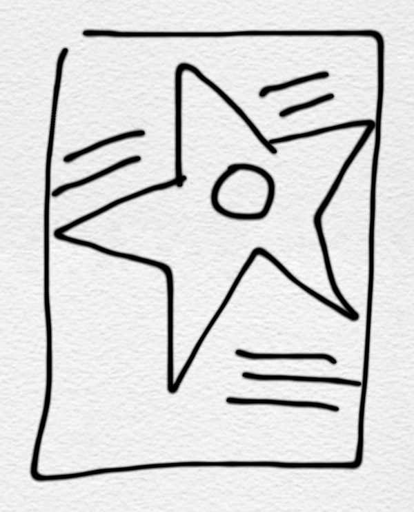
Sketches: Walking With The Stars
Nothing too terribly complicated here. I actually came up with the basic idea while driving (which wasn't as dangerous as it might sound), and did a quick sketch on my iPhone will waiting at a traffic light...

...and elaborated on that basic idea in the customary series of thumbnails.

I had it in mind to do something simple and bold (and flat) — but the Author asked that the star be less yellow and bright, and further along that process it also became slightly more representative of an actual Walk of Fame star (which had been part of all my original sketches, anyway). It took some time to work out the details, as the design elements on the star now had to have depth and shading, but I still tried to keep the design (mostly) flat.


I don't think this was entirely successful — if I were to approach the question again, I'd probably just make the star a flat, but more golden color and have done with it (and avoid those additional elements altogether). The gold detail seems to look darker and less delicate when the image has been reduced, though, so perhaps it will all work out better in print.
That's dummy copy on the upper right hand corner of the blue cover. The subhed proved to be too long to fit up there, so it was moved to the lower left. (The Author also asked for the color to be more purple than midnight blue.)
...and elaborated on that basic idea in the customary series of thumbnails.
I had it in mind to do something simple and bold (and flat) — but the Author asked that the star be less yellow and bright, and further along that process it also became slightly more representative of an actual Walk of Fame star (which had been part of all my original sketches, anyway). It took some time to work out the details, as the design elements on the star now had to have depth and shading, but I still tried to keep the design (mostly) flat.
I don't think this was entirely successful — if I were to approach the question again, I'd probably just make the star a flat, but more golden color and have done with it (and avoid those additional elements altogether). The gold detail seems to look darker and less delicate when the image has been reduced, though, so perhaps it will all work out better in print.
That's dummy copy on the upper right hand corner of the blue cover. The subhed proved to be too long to fit up there, so it was moved to the lower left. (The Author also asked for the color to be more purple than midnight blue.)
28 September 2011
Haunted Airways

As an added bonus, for some reason this copy had seven One Dollar Silver Certificates hidden inside, most from 1957 (one was from 1935), a few of which look as though they had been minted only yesterday.
Star Trek in High Definition
I'm so very thrilled that I'll finally be able to see that episode (I forget what the title is), you know the one, where young Wesley Crusher stumbles over a flower bed and is consequently sentenced to death — in glorious high definition!
25 September 2011
Better Unknown
We went to see the Croton Dam, the day after heavy rain (the remnants of a hurricane) had passed through the area during the night. The scale of the waterfall was breathtaking, and the river it fed into rushed by at a furious pace.
We were surprised to see five men carrying in an inflatable raft — properly dressed for the occasion, and obviously experienced. We saw them again a bit later, further along the fast-moving river as they passed under a small bridge.
We found out later that the inflatable raft had overturned, and all had to be rescued from the river. One of the men, unfortunately, had died.
My wife wishes I hadn't told her. I wish I didn't know.
What I still haven't told her, and the memory that continues to haunt me, is of two women with very young children who were with the men as they were trying to make the decision on where to begin the journey.
20 September 2011
Sketches: The New York Old-Time Radio Schedule Book
From time to time, I'll have the opportunity to work on a book that doesn't have a designated cover photo, because none have been selected, or seem appropriate, or meet the technical requirements — or because there are no illustrations inside the book (which was the case here). That makes more work for me, but it also offers much greater opportunity, and (usually) much more fun. I'll create an interesting or unusual type treatment for a mostly type-driven design (I went with the one on the left), or I'll have some other idea that I think might be made to work. This was a some-other-idea. Here are some sketches (somewhat more sketchier than usual):

My first thought was to use a real, actual newspaper page of radio listings (though I wasn't entirely sure what I would do with it), and somehow go from there — fifteen or twenty minutes of searching, though, made it clear that this might not be so easy to find, after all. (I have a bound volume of The Knickerbocker News from the 1940s — it's really cool! — but this book is a collection of listings from The New York Times, so the stations would all have been wrong.)
Instead, I thought it'd be fun to use a photo of an old radio from stock photgraphy (perhaps even three different ones, since this was a three-volume set of books), and have a series of concentric circles, representing radio waves, emitting from it. The shading of the circles would have a rough texture (and the edges would be defined by that texture), that might have been shaded by hand with a crayon and coquille board, back in the day.
But I decided not to go with stock photography, after all. I couldn't seem to muster up much enthusiasm for having to find three distinct images that would have fit with this design, and I don't think a photo would have worked as well as a stylized drawing (which might have been more difficult to find), anyway. Instead, I made the volume number information the sort of focal point of the concentric circles, and adjusted the type a bit so that everything seems to eminate from that point (or, if nothing else, from that side of the cover).

I had conceived the cover colors as yellows and golds and browns (you can see that in the sketch), a slightly off-white background with golden waves — the black-and-grey background was, really, a happy accident, one of the benefits of working with tools with which you can try just about anything without hesitation.
Another thought was to extend the image of the cover to the spine — instead, I decided to use parts of the same image on the spines of all three books that will (hopefully) form a complete image when side-by-side on a bookshelf.
 I say "hopefully," because there's no guarantee that the books will be bound with this kind of precision (I've had issues with this stuff before), but why not try just the same?

My first thought was to use a real, actual newspaper page of radio listings (though I wasn't entirely sure what I would do with it), and somehow go from there — fifteen or twenty minutes of searching, though, made it clear that this might not be so easy to find, after all. (I have a bound volume of The Knickerbocker News from the 1940s — it's really cool! — but this book is a collection of listings from The New York Times, so the stations would all have been wrong.)
Instead, I thought it'd be fun to use a photo of an old radio from stock photgraphy (perhaps even three different ones, since this was a three-volume set of books), and have a series of concentric circles, representing radio waves, emitting from it. The shading of the circles would have a rough texture (and the edges would be defined by that texture), that might have been shaded by hand with a crayon and coquille board, back in the day.
But I decided not to go with stock photography, after all. I couldn't seem to muster up much enthusiasm for having to find three distinct images that would have fit with this design, and I don't think a photo would have worked as well as a stylized drawing (which might have been more difficult to find), anyway. Instead, I made the volume number information the sort of focal point of the concentric circles, and adjusted the type a bit so that everything seems to eminate from that point (or, if nothing else, from that side of the cover).

I had conceived the cover colors as yellows and golds and browns (you can see that in the sketch), a slightly off-white background with golden waves — the black-and-grey background was, really, a happy accident, one of the benefits of working with tools with which you can try just about anything without hesitation.
Another thought was to extend the image of the cover to the spine — instead, I decided to use parts of the same image on the spines of all three books that will (hopefully) form a complete image when side-by-side on a bookshelf.

07 September 2011
Fourth Grade
I don't have much memory of Fourth Grade. I have a somewhat vague recollection of Third Grade (and resentment at having lost a spelling bee), and more substantial memories of Fifth Grade (I prepared a report on the state of Montana), but Fourth Grade remains shrouded in mystery. Even what I think I remember, I'm still not sure of. (I collected Freakies cereral premiums with two friends in my class, and we made gadgets out of big rubber erasers by drawing on them. But wasn't that was still in Third Grade?)
My son started Fourth Grade day before yesterday. He's excited about the new year (though still a bit nervous), and doesn't seem to mourn the loss of his unstructured summer days, not in the way I remember. Not yet, anyway.
My son started Fourth Grade day before yesterday. He's excited about the new year (though still a bit nervous), and doesn't seem to mourn the loss of his unstructured summer days, not in the way I remember. Not yet, anyway.
Donkey Dollars

25 May 2011
Purple Book

20 May 2011
Sketches: You Wouldn't Like Me When I'm Angry!
I've been working on another book by the author of Just When You Thought It Was Safe: A JAWS Companion (I wrote about the design process for that project here), and the structure of this new book was similar enough that I took this as an opportunity to do something similar with the Design.

Lots of different directions here, for the pages that start off the various section, though I knew I'd only follow through with something that would be easy to implement, given the constraints of the format. I also wanted to find something I could carry over to the cover, more or less — more on that in a moment.


I went simple and bold (there's an additional page for "Film," as well), and that typeface, Berthold City, is used extensively throughout the book.
I'd wanted to do something similar with the cover (I made note of an idea in the lower right corner of the set of thumbnail sketches), but that turned out to be a bit more involved. I had a very clear idea of what I'd intended at the start, so I didn't do more than a quick sketch to work out an idea I'd had about color. I was thinking it might be fun to do the cover predominantly green, not unlike to this book, which was predominantly yellow.
 (The original plan was to set the word "Hulk" on the cover in Berthold City, but I didn't like the shape of the letter K. True story. As much as I like about that typeface, there are several aspects of it I don't — I even set the punctuation marks in the title in a different font.)
I think if I'd taken time to think on this a bit longer, and made some additional thumbnails, I probably could have saved myself all kinds of headache. Because when I started setting everything up I realized that using the word "Hulk" as a big design element was going to be trouble. The full title of the book is You Wouldn't Like Me When I'm Angry: A Hulk Companion, and I couldn't find a way to join "A" and "Companion" with that enormous "Hulk."

I thought I might make the word "Hulk" smaller (I didn't want to abandon it), thinking I could find a way to make it fit better as part of the title. But that didn't work, and I never really did solve that problem — not in an ideal way. Instead, I decided to just use the word as a big ol' graphic element, and set "A Hulk Companion" in small type, with the hope that I could find a way to keep the two from interfering with one another. (Why does it say "Hulk" on this cover twice?) I think I've managed that, though it was a process of trial and error.
And there was a great deal of trial, and of error. For whatever reason, I still wasn't completely satisfied with what I was coming up with, so I spent lots and lots (and lots) of time considering alternatives.


(By the way, the various shades of green are brighter and much more vibrant than these JPEG images seem able to demonstrate.)
Even after putting significant effort into it, I still wasn't ready to commit to my initial design, on the left. So I put together another (that's the one on the right), and tried to make everything work. But it really didn't. The word "Hulk" becomes less a graphic element, much more a word, across the center of the cover — when it's on that left edge, you know what it is, but it doesn't "read" the same. That, and there's much too much dead space around the photo on the bottom (which is more vertical), and even around the one on top (which is smaller than it should be in an effort to try to accommodate that photo on the bottom).
I think that second version might be made to work better, somehow, but the more I look at it? That's a cover that anyone could have done. It's just not the kind of cover that I would have done.
There's still something about that photo of Lou Ferrigno, though, that just isn't working for me — it's not that strong a pose, and because of this, it's just not that strong a cover photo. (The makeup seems different from what appeared in the TV series, as well). These are, however, the only two color photos I have. So I quickly put together a third alternative (by that time, it might even have been a fourth), abandoning the second photo altogether.

(I really love that photo, and the idea that it would have had to be painstakingly composed with multiple exposures, back in the day, rather than digitally composited.) That's better, I think, but again, there's that same problem with the redundant word "Hulk," now made much more prominent than ever. I could probably find a way to make it work (and who knows, I may have to, because I haven't submitted any of these designs yet!), but I think I'm going to follow the direction my instincts were taking me before I started doubting them.

(That green stripe that runs down the center, while visually connected to the front cover, is the spine. It's a 500-page book!)
Lots of different directions here, for the pages that start off the various section, though I knew I'd only follow through with something that would be easy to implement, given the constraints of the format. I also wanted to find something I could carry over to the cover, more or less — more on that in a moment.
I went simple and bold (there's an additional page for "Film," as well), and that typeface, Berthold City, is used extensively throughout the book.
I'd wanted to do something similar with the cover (I made note of an idea in the lower right corner of the set of thumbnail sketches), but that turned out to be a bit more involved. I had a very clear idea of what I'd intended at the start, so I didn't do more than a quick sketch to work out an idea I'd had about color. I was thinking it might be fun to do the cover predominantly green, not unlike to this book, which was predominantly yellow.
I think if I'd taken time to think on this a bit longer, and made some additional thumbnails, I probably could have saved myself all kinds of headache. Because when I started setting everything up I realized that using the word "Hulk" as a big design element was going to be trouble. The full title of the book is You Wouldn't Like Me When I'm Angry: A Hulk Companion, and I couldn't find a way to join "A" and "Companion" with that enormous "Hulk."
I thought I might make the word "Hulk" smaller (I didn't want to abandon it), thinking I could find a way to make it fit better as part of the title. But that didn't work, and I never really did solve that problem — not in an ideal way. Instead, I decided to just use the word as a big ol' graphic element, and set "A Hulk Companion" in small type, with the hope that I could find a way to keep the two from interfering with one another. (Why does it say "Hulk" on this cover twice?) I think I've managed that, though it was a process of trial and error.
And there was a great deal of trial, and of error. For whatever reason, I still wasn't completely satisfied with what I was coming up with, so I spent lots and lots (and lots) of time considering alternatives.
(By the way, the various shades of green are brighter and much more vibrant than these JPEG images seem able to demonstrate.)
Even after putting significant effort into it, I still wasn't ready to commit to my initial design, on the left. So I put together another (that's the one on the right), and tried to make everything work. But it really didn't. The word "Hulk" becomes less a graphic element, much more a word, across the center of the cover — when it's on that left edge, you know what it is, but it doesn't "read" the same. That, and there's much too much dead space around the photo on the bottom (which is more vertical), and even around the one on top (which is smaller than it should be in an effort to try to accommodate that photo on the bottom).
I think that second version might be made to work better, somehow, but the more I look at it? That's a cover that anyone could have done. It's just not the kind of cover that I would have done.
There's still something about that photo of Lou Ferrigno, though, that just isn't working for me — it's not that strong a pose, and because of this, it's just not that strong a cover photo. (The makeup seems different from what appeared in the TV series, as well). These are, however, the only two color photos I have. So I quickly put together a third alternative (by that time, it might even have been a fourth), abandoning the second photo altogether.
(I really love that photo, and the idea that it would have had to be painstakingly composed with multiple exposures, back in the day, rather than digitally composited.) That's better, I think, but again, there's that same problem with the redundant word "Hulk," now made much more prominent than ever. I could probably find a way to make it work (and who knows, I may have to, because I haven't submitted any of these designs yet!), but I think I'm going to follow the direction my instincts were taking me before I started doubting them.

(That green stripe that runs down the center, while visually connected to the front cover, is the spine. It's a 500-page book!)
16 May 2011
Freehand
I do lots of sketches — I like making sketches early in the design phase of a project, to explore possible solutions to a problem before I start working. I bought an iPad app, Penultimate, because I really like the way it renders pen strokes (it seems to vary the line width a bit based on the speed that the pen is moving, which makes the results seem slightly more organic), and I thought it might be fun to try using that for thumbnails and sketches and whatnot. I also bought a stylus, for more or less the same purpose.
It's a capacitive stylus, though, with a foam tip, a very big and round foam tip, one that doesn't offer a great deal of precision. My favorite writing and drawing pens are nice, new Sharpie markers (they're not as much fun when they're dull), and I'm accustomed to the cause-and-effect of writing and drawing with them. (The Ultra Fine Points are nice for detail, too.) Not so much so with a big round foam tip — I don't have the degree of control I want. I tried this afternoon, and the results were disappointing. (I gave up after about a half-hour, and used good ol' pen and paper, instead.)
I think I want a stylus with a more narrow tip, one that's more like the shape I'm comfortable with. There doesn't seem to be such a thing available, though, which might be a limitation of the technology.
11 May 2011
Restart
When you're young, and the whole world seems spread out before you, change can seem exhilarating. Everything is adventure.
But it isn't the same when you're older. It doesn't seem the same, anyway. You might try to disguise it by saying you have responsibilities, or you have people who are depending on you — but what it really is is that you have become comfortable, and change has become difficult and frightening.
I’m in a situation where change seems just about inevitable, and I’m trying to find a way to turn that to my advantage.
30 April 2011
Familiar, Forgotten
I watch a lot of old movies. In fact, given the chance, I'll set the DVR to record just about anything made prior to 1935 (even better if it was made prior to 1934, when the Hays Code really went into effect), and I'm almost never disappointed with what I find.
One of the pleasures in this is discovering large parts of pop culture history that seemed to be, before recently, all but forgotten. Once you begin watching these movies, faces you'd never seen (or heard of) before become familiar, and it's a surprise when you discover how many movies these actors were featured in, and how popular and well-known they were at that time. Warren William is one of them — he made 30 or 40 films as a leading man at Warner Bros. (most often as a heartless, amoral businessmen), yet before I started watching his films on TCM, I'd never heard his name.
Kay Francis is another. Through the mid-1930s, she was the top female star at the Warner Bros., and the highest paid American film actress. She often made more than a half-dozen films each year during that era, she was enormously popular and very famous. Yet again, though, I'd never heard of her before discovering her work on TCM.
In fact, it was a real surprise to recognize her caricature in a 1939 Columbia cartoon, Mother Goose in Swingtime (you can see her here, as the first of the three celebrity caricatures). Almost every studio did cartoons like these, full of popular, well-known celebrities of the day, but this was the only one I've seen that featured Kay Francis (though her career was beginning to decline by 1939, following a bitter contract dispute with Warner Bros. two years earlier).
That decline would bring her to Poverty Row, specifically to Monogram Pictures, where she made her last three films (albeit with star billing and a Producer credit), beginning in 1945. I watched one of those films, Allotment Wives, just last night, lured by the promise of an unknown film noir classic and curiousity. It was said to have been made in the wake of the unexpected success of Mildred Pierce, and several of the reviews I've read struggle to find a parallel in the Mother-will-do-anything-for-her-selfish-daughter story, but that's hardly the point of Allotment Wives. Other reviews want to place this in the pantheon of forgotten film noir, but it doesn't really fit there, either — not if you believe that great film noir ought to have great script and a compelling visual style, neither of which are to be found here. Still, it's fun to see Kay Francis in a less-familiar, less sympathetic role.
(And on the subject of something you'd never heard of — the plot of Allotment Wives is, in itself, a small history lesson. From the TCM synopsis: "Throughout World War II and into peace time, the U.S. government operates the Office of Dependency Benefits, which handles the issuing of allotment checks and family allowances to women with husbands serving in the [armed] forces. However, when evidence of many fraudulent claims for support come to light, Col. Pete Martin of Army Intelligence is assigned to O.D.B. to find the unscrupulous women who have been entering into multiple marriages with servicemen in order to claim their allotments and allowances.")
26 April 2011
Archaeology
Not too long ago, my wife and I spent several days sifting through her Father's assembled — stuff, that's probably the best word for it. He's more than 90 years old by now, and I think he's saved something from each and every day of those many years, and that stuff has all found its' way into the corners, and closets, and shelves of a very old house. (He hasn't spent the entire 90 years there, but from the amount of clutter, you'd sure think he had.)
It's not a case of compulsive hoarding, not by any means, and not everything has been saved indiscriminately (though that seems to have been more the case as time went on). But it's as though he emptied his metaphorical pockets from time to time, kept what seemed important or interesting, and there always seemed to be something important or interesting.
It was the boxes and bins of assorted papers, some going as far back as the 1940s, that require the most attention. Particularly the boxes from the eaves of the top floor, a long, narrow hallway along one side of the house leading to an unused office. The roof is leaking around the chimney (the house has been unoccupied, so this had gone unnoticed for several months), and several boxes (and their contents) have become damp, even moldy as a result. (A few plastic bins of papers and whatever else are now full of standing water, and we haven't had the chance to go through them.)
So it became a more urgent matter, to find anything of historical or sentimental value before any further harm could come to it — especially family photos. Several photo albums had already been damaged by water, though the photos contained in them were, thankfully, intact. Other photos have been carelessly and indifferently stored and all but forgotten — hidden among correspondence and magazine clippings and postcards and an airline boarding pass (from the 1950s!) and mimeographed pages from fanzines and I-don't-know-what-else.
And so much of it was of interest, because it was so old — and often so unexpected. A 1953 letter from a friend overseas who had fallen on hard times, along with the receipt for $1,000 sent to him by telegraph. A postcard with one single line, commenting on the recent death of an well-known author, but with no indication of who that author might have been. Newspaper clippings. Press passes. Business cards. A ticket to see the Brooklyn Dodgers play at Ebbets Field.
And we were obliged to look through all of it, every last scrap. It wasn't like an archaeological dig, where objects of interest from a given era were in close proximity with one another, or at least followed some sort of reasonable progression as you dig deeper. Something of value might be hidden just about anywhere. School class photos from the 1930s were found, inexplicably (though beautifully preserved) in a random plastic bin among what seemed to be junk mail and magazines from the late 1980s. We'd have a second look at boxes we had already sorted through, or thought we had sorted through, only to find something unforgettable we'd somehow missed. The discoveries were exciting and gratifying, but the fear that we've overlooked something of value is maddening.
The photos were still in good condition, more or less the same condition they had probably been in for decades. The color prints had faded, but the black-and-white prints hadn't — even the paper hardly seemed to have aged.
And that got me thinking. My son, and his children, and generations going forward, they may never have the opportunity for discoveries like these. Most photos these days are taken and stored in a digital format, and probably won't offer the amazing experience of sifting through a box of ephemera and stumbling across an uexpected photographic print that's fifty, or sixty, or even seventy years old. And digital files can't be stored so indifferently — they'll need maintenance, much more maintenance, if for no other reason than to make sure they're in a format that current technology (whatever it is) can still access. I can't imagine they'll withstand the ill effects of a leaky roof as gracefully.
12 April 2011
Kindled
I finally bought an iPad — I stood in line for a few hours to (hopefully) buy one the evening the iPad 2 went on sale. Ostensibly this is a development tool — you can't really develop for a device that's nothing more than a simulator on your desktop computer — but really, I'd just been anxious to use one, after reading about them for the past year.
More than anything else, I find I'm using it for reading. Mostly in Instapaper, which is where I read virtually all of the various newspaper and magazine articles I come across in the course of a day — sooner or later. (They tend to accumulate.) Instapaper provides a very pleasant, mostly distratction-free reading experience, so very comfortable that it's led me to be kinda curious about eBooks.
I discovered that our local library has an eBook lending service (via the county's library system). Once I paid a small fine (left over from 2007), I was able to find a few items of interest — but unfortunately, the selection seems thin. If I want to read eBooks, I'll have to make a few uncomfortable compromises.
I've written before of my love of books — you know, real, physical books. The kind you hold in your hands, feel the pages flip through your fingers. Paper that discolors over time as it sits on a shelf. I don't mind reading books on a digital device, but I haven't yet made peace with the idea of reading them only on a device, owning them only as an idea, rather than as an object. Oddly, I don't have this problem with other forms of media — I just can't seem to get past this with a book. Not yet, anyway.
I've installed the Kindle app for iPad, though, and it is as beautiful and pleasant a reading experience as I could hope for. Amazon foolishly, recklessly, allows free downloads of the first chapter of a book as a sample, and I will (probably) consume as many of them as I can.
11 April 2011
More Than A Secretary
For some reason, I find I can't take seriously the idea of George Brent as a leading man past, say, 1934. But I wonder why I haven't seen more of Dorothea Kent, who is brings a bright spark to the traditional "dumb blonde" role. (It's too bad the name "Maizie" seems to have been mostly forgotten after the 1940s.)
And Jean Arthur? I could just listen to her forever.
And Jean Arthur? I could just listen to her forever.
07 March 2011
Trivia
I'm recently 47, which is in itself the source of some ambivalence — but I'm delighted to discover that there's still something left to surprise me. Not the important stuff, but the stupid, trivial stuff that I thought I already knew (or had known, and had already forgotten).
For example: did you know that "Last Train To Clarksville" (best known as The Monkees' debut single, though probably more accurately attributed to Boyce and Hart, since the music was performed by studio musicians) was essentially an anti-war protest song? It's the story of a young man who has been drafted, and he knows he may die in Vietnam. I suppose it might also be interpreted as someone fleeing the draft, as well.
I'm not sure how I've never heard this.
06 March 2011
Happy Birthday!
 It's Guy Kibbee's birthday today! (That's him on the right, in case you were wondering.)
Speaking of which, I had the opportunity, not too long ago, to see one of his early films — City Streets, made at Paramount in 1931. While notable as a precursor of "film noir," I mention it here because I think it's the only film I've ever seen Guy Kibbee in where he wasn't paying a mostly comic character — he's genuinely sinister here! (It's a terrific film, and highly recommended.)
01 March 2011
The Hybrid
 This was my very first iBook, from 1999. (That is, unless you count the one I borrowed for about two weeks while waiting for this one to ship. Waiting took forever.) This was my very first portable computer (and my first computer to use a wireless network, technology Apple had introduced to consumers at the same time this model was introduced), and this convenience changed everything. It would be several years more before I bought another desktop computer, and even then, this was only because I needed a larger screen size for the type of work I do. Otherwise, I might have never gone back to using one.
I haven't actively used this iBook since it was replaced by another model — same design, different color, this time a brilliant electric green — about a year or so later, but it still has enormous sentimental value to me.
It was lent out to someone for a few years, and some time after it was returned, I replaced the internal hard drive (mostly because I had another hard drive from another iBook that I couldn't find any productive use for), and that was no mean feat. I had thoroughly detailed instructions to follow, of course, but there are approximately 3500 tiny screws that need to be carefully unscrewed and even more carefully kept track of. I did all right, I suppose (I had only a few screws left over) but in the process of doing so I somehow damaged the logic board — everything worked except the speaker output.
So I bought a second-hand logic board. It came with the bottom of the computer attached, and that was blue (or "Blueberry"), instead of orange (or "Tangerine"), but it cost next-to-nothing, and that made all the difference. So I put everything in the bottom of my office closet for, I dunno, I suppose it's been three or four years.
Today, anxious for an excuse to avoid doing actual work, I decided I ought to finally replace that logic board. (I'd been putting it off as a project to do with my eight-year-old — he had watched me replace the internal hard drive — but I decided it'd just be easier to keep count of the 3500 tiny screws in peace and quiet.) Four hours and a few questions like "where does that tiny spring that I've never seen before go?," I have a somewhat refurbished hybrid Tangerine-and-Blueberry iBook.
It's almost achingly s-l-o-w-w-w-w by the standards I've become accustomed to, almost twelve years later, and amusingly, the screen size isn't wide enough to fit my photo blog, and I had to set up an ad hoc network because the hardware can't handle the more recent encryption standard my wireless network uses, and the battery will no longer charge, so it's a portable computer only in the sense that it has a handle — but somehow, despite everything, it still works. This delights me no end.
26 January 2011
Forecast
I've become conflicted about this "snow day" stuff. You see, as a former child, I understand quite well the thrill of the snow day, and believe me, I still share in that excitement. We've had at least one snow day every week this year so far — if I were still eight years old? I would have thought this was the best year ever. He loves going to school, but the snow day is like an unexpected (well, mostly unexpected) gift.
As a parent, though, I don't seem to get too much done these days while my eight-year-old is home. Not that he isn't able to entertain himself, but his interests have become more and more ambitious with age, and often involve taking an old toy apart, either to fix it or just to see how it works (or worked). So I get called in for frequent consultations. It hampers my productivity, which, in turn, kinda nags at my conscience.
Tomorrow could go either way. There's lots of snow expected — but it's expected to end by daybreak, which should allow plenty of time for the roads to be cleared. But then, we had an unexpected few inches yesterday morning, and then an unexpected few more during the day today, so who knows?
23 January 2011
Faded
Why is it that so many of the books I've worked on are by middle-aged men, writing about their unlikely friendships — or unhealthy relationships, depending on how you want to look at it — with elderly women, forgotten actresses from the Hollywood of the 1930s and 40s who worked steadily, back in the day, but never found enough fame to be remembered?
21 January 2011
Drift Off
Somehow, we've experienced about three months worth of snow days over just the past two weeks.
13 January 2011
Bureaucracy
I am the sort of person who enjoys poking holes in a bureaucracy -- mostly because it amuses me, but hey, if there's some way I can put it to my advantage, all the better. Give me the opportunity to find the weak link in a chain of responsibility, and I will exploit that as much as possible. (It's just the way I am.)
I have a tendency to rebel against authority (that gets me into trouble from time to time, but it's served me well, mostly), and if there's one authority I find anything but, well, authoritative, it's bureaucratic authority. Pencil-pushers, file-filers, form-filler-outers — I have no use for them.
I've been quietly mired in both authority and bureaucracy (in more or less equal proportion) for almost the past two years. I've been able to take advantage of the bureaucracy and evade the authority, thank goodness, mostly losing myself in the shuffle of personnel over the past year or so. I like it here, peaceful and quiet, hiding beneath a deflated balloon.
11 January 2011
Dangerous
 I'm not exactly sure what this is, but my eight-year-old built it on the floor of my office, and I'm afraid to move it because it looks dangerous.
03 January 2011

Tomorrow
I'm content not to make too much of the change from one year to the next — each day seems more or less like the next (or the last), no matter where we choose to place it on the calendar. (I'm the same way about my birthday.) But I think I'll be glad to let 2010 pass into the past with good riddance.
It has not been a good year. Then again, it hasn't been a bad year, either. It could certainly have turned out worse, and I've had years where worse (much worse) things have happened (I'm constantly reminded of others' bad fortunes that we've managed to escape), but it's been difficult to shake the increasing sense of uncertainty during the past year. That's what's worn me down — that, and a sense that no matter how hard I've worked over this year, I don't seem to have accomplished anything to ease that uncertainty.
So this time, just once, I'm happy to use the end of a year as a way to close out the books, and open a new ledger. Not with a sense that anything is going to be different (certainly not in the short term), just to try to leave some of it behind.
